“I don’t know where I am”
Two products shared one front door, and the single most common search on the platform was no search at all.
- Role
- Product Design Lead
- Org
- Discovery Education
- Product
- Experience
- Partners
- Product · Engineering · Curriculum · Analytics · Marketing
The most-run query was empty
Teachers logged in, landed on the home page, went straight to search, and pressed enter without typing anything. Not occasionally. An empty query was the most common search on the platform. The second most common was “magic school bus.”
An empty search isn't a search. It's someone looking for a place to stand. Teachers were using the search results page as a landing page, because the actual landing page hadn't told them where they were or what they could do there. They skimmed past it, since it wasn't what they were looking for, and kept going until they hit a screen that at least showed them the shape of the library.
That reading matched what teachers said out loud. Across interviews and field feedback, one complaint came back more than any other.
I don't know where I am.
the most consistent piece of user feedback we had
Behavioral data and stated frustration were describing the same failure from two directions. That framing is what made the problem tractable: this wasn't a search-relevance problem or a content problem. It was an orientation problem.
Two products, one front door
The platform home and the Experience home had converged into effectively the same surface. Curriculum packs, tools, subject entry points, and product tiles all competed on one page, and nothing on it answered the question a teacher actually arrives with: what do I do next?
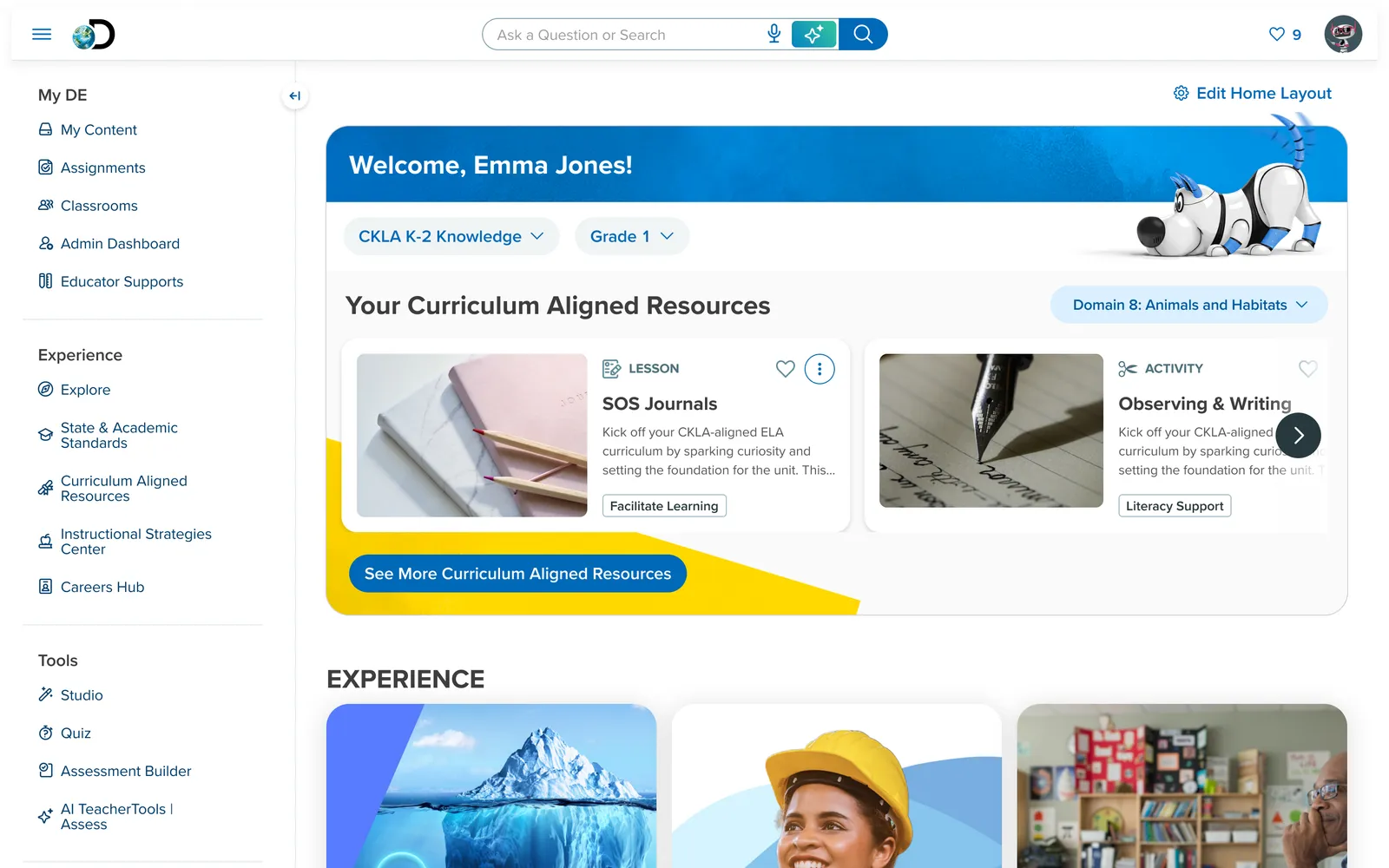
Underneath the layout problem was a harder one. Ask a teacher what Experience was and they couldn't tell you. It was all just “DE.” The product had no identity distinct from the platform it sat on, which meant it couldn't be described by sales, couldn't be found by users, and couldn't be measured by anyone.
The symptoms showed up everywhere at once:
- Teachers couldn't find content matched to their grade, subject, and teaching context
- “I didn't know we had that feature” was a routine response in research
- No clear answer to what came next after finding a resource
- Sales couldn't tell a coherent story about where the product fit
- Internally, nobody agreed on the boundary between Experience and the platform
What made it hard
This was a live product with a decade of habit built on top of it, mid-migration between design systems, owned by no single team.
- Legacy and new coexisting. The product was a mix of legacy platform pages and newer design system pages, so any change had to work in both worlds at once.
- The school calendar. Teacher habits are seasonal and releases are too. You cannot rearrange a teacher's room in October. Large-scale change has to land when they're able to absorb it.
- Identity was a shared decision. Experience's identity couldn't be defined without the platform's identity being defined alongside it, and that sat with a different team.
- Inherited work. A prior third-party UX engagement had already produced direction. My job started with continuing and translating that work rather than restarting it.
- Moving org. Team and ownership changes ran through the whole effort.
The question we agreed to answer
I ran a series of cross-functional workshops across design, product, engineering, curriculum, analytics, and marketing to get to one problem statement everyone would actually sign up for. The output mattered less than the alignment: for the first time the teams had shared language for what we were solving.
How might we design an educator experience that makes finding the right content fast and intuitive, personalizes to each teacher's grade, subject, and region, simplifies navigation through a consistent interface, and communicates the product's role in the broader ecosystem, all while respecting how little time teachers have?
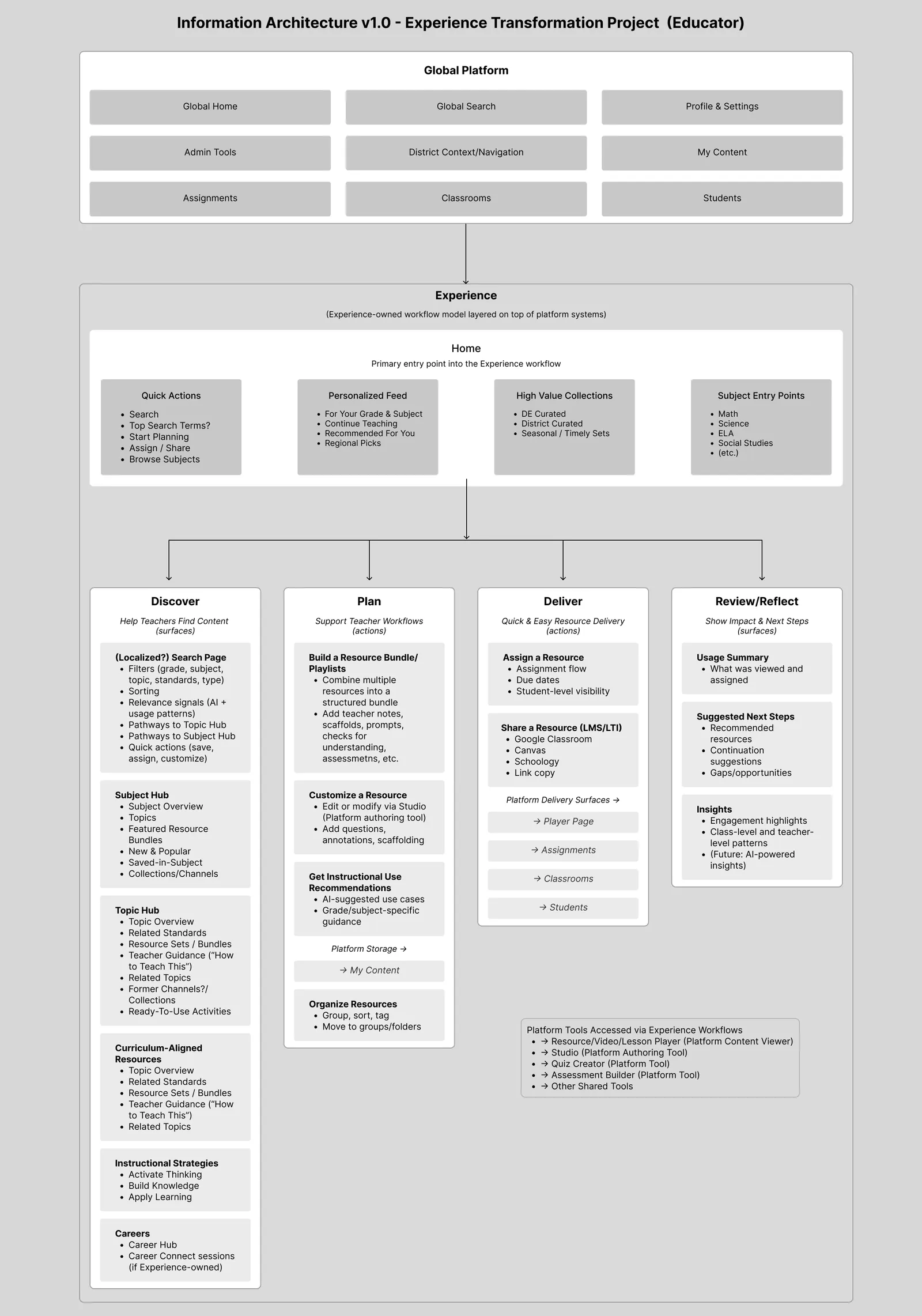
A model of the work, not a map of the org
Products drift toward mirroring the company that builds them. The fix was to anchor the architecture in what teachers do instead, and to name it in four stages we could all point at: Discover, Plan, Deliver, Reflect.
This gave us something we hadn't had: a test. When a debate started about whether some capability belonged to Experience or to the platform, we could ask which stage of the teacher's work it served. Ownership arguments that had run for months became answerable in a meeting.
Organizing by instructional purpose
The piece I'd defend hardest is the taxonomy. Content had been organized the way a library is organized, by what a thing is. A video, an activity, a lesson, a quiz. But a teacher planning tomorrow morning isn't looking for a video. They're looking for something to open with.
So topics are banded by the job the content does in a lesson:
- Activate Thinking: get them in the door
- Build Knowledge: teach the thing
- Practice & Review: make it stick
- Apply & Extend: push it further
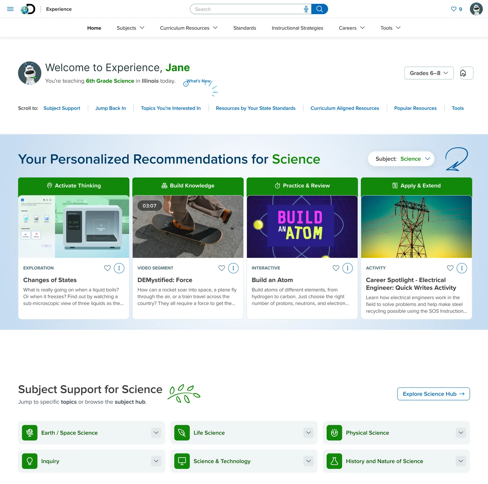
Those bands are a teaching model, not navigation categories. The information architecture mirrors the sequence of instruction itself, which means a teacher scanning a topic page is reading something already shaped like their lesson plan. Combined with a real hierarchy of subject, then topic, then resource, a page could finally answer “where am I?” without the teacher having to ask.
The clearest way to see it is on a single topic. For a sixth-grade unit on force, the four bands line up as a car-collision video to open with, an explainer to teach from, an interactive to practice against, and a student investigation to extend into. One complete lesson arc, readable in a single row.
Live prototypeExperience home, prototypedBuilt in Nuxt to stress-test the model: personalization, the instructional-strategy bands, and continuity through Jump Back In.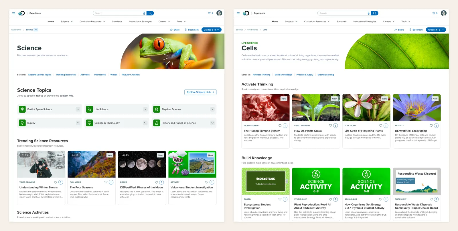
Closing the loop between teachers and students
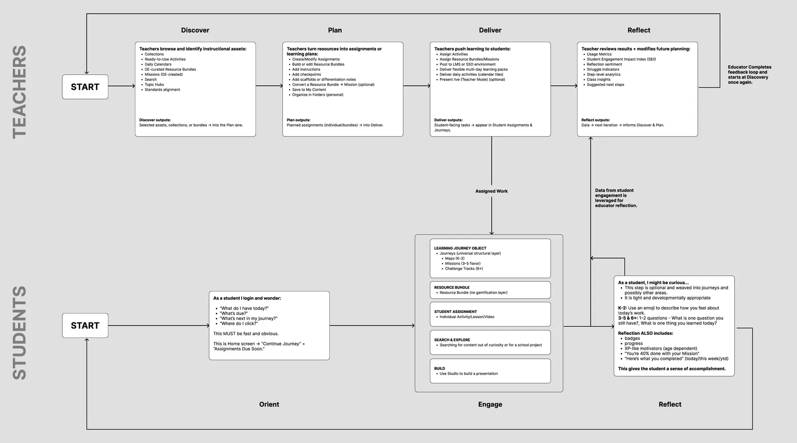
A workflow product that stops at “assigned” is only half a product. I mapped both sides as one system: the teacher's Discover → Plan → Deliver → Reflect running above, the student's Orient → Engage → Reflect running below, and a return path where what students actually did with an assignment feeds back into the teacher's next planning cycle.
That return path is the argument. It's what makes the teacher's reflect stage real instead of decorative, it's what makes impact visible to district leaders, and it demonstrates that the product is designed as a whole rather than a set of fragments.
Defining a word everyone used and nobody had defined
Across my time in edtech I've listened to a lot of product leaders ask their teams for “engaging” experiences without examining what that actually requires. Over the past decade the word became a catch-all for badges, avatars, and streak mechanics. Shallow features standing in for design that meets a student where they are. Some of those mechanics genuinely do hold attention, but attention is not learning. You can capture one without ever earning the other.
Engagement isn't really a product feature. It's a psychological state, and cultivating it means sitting with a person, listening, attuning, and seeking genuine understanding. That is a harder thing to ask a roadmap for, which is exactly why it gets replaced with points.
Which brought us here. Leadership had one non-negotiable: whatever we built had to be measurable. But “engagement” was being used to mean six different things depending on who was talking, and the platform's existing proxy was completion, which measures compliance and calls it learning.
So I wrote the definition down, starting with what it isn't:
We are not saying engagement is learning. We are saying engagement helps answer why learning sometimes fails or succeeds when content quality is held constant.
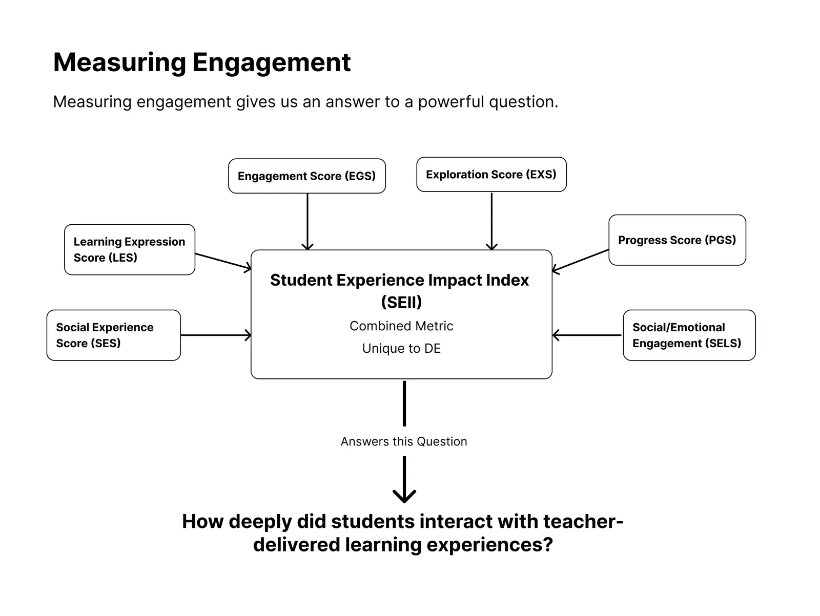
From there, six component measures (engagement, progress, exploration, learning expression, social experience, and social-emotional engagement) composing into a single index. Exploration counts optional content and time in non-required material, because curiosity is a signal. Learning expression is reflection-driven: one thing I learned, one question I still have.
The index answers one question: how deeply did students interact with teacher-delivered learning experiences? Each persona gets their own version of it. District leaders ask how embedded the product is in instruction, teachers ask whether students engaged with what they intended, students ask whether it was worth their time.
Three passes to get here
The direction inherited from the prior third-party engagement was a starting point, not an answer. We went through three major design iterations before landing where the product is now. Each one stress-tested the model against real teacher workflows and against what engineering could actually deliver inside the release calendar.
Rapid prototyping did most of the work of settling arguments. Rather than debating concepts in the abstract, I built them, using AI tooling to get from idea to working prototype fast enough that a concept could be argued about on a screen in the same week it was proposed. A bundling interaction let teachers collect resources while browsing instead of breaking flow to go somewhere else. Asset cards were reworked so a teacher can tell what they're looking at in under two seconds.
Being able to hand a team something clickable changed the shape of the conversation. Objections that would have taken a month of meetings to surface arrived in an afternoon, which is the entire point.
Within two to three weeks of the first workshop, the effect was less about artifacts than about momentum: engineering, product, analytics, curriculum, design, marketing, and leadership working from one mental model, decisions moving faster, and the harder conversations about risk and tradeoffs finally happening in the open.
Outcome
Experience and the platform now have separate homes, and Experience has a real one: a page built around what a teacher came to do rather than a directory of everything the company sells. Content sits in a clear hierarchy, banded by instructional purpose. Navigation was rebuilt against the four-stage model.
The prototype held up well enough to leave the design team. Built in Nuxt with Claude Code and Cursor, it was polished enough that the Director of Experience took it directly into client sales conversations, and credits it with helping retain clients and win new business.
Field feedback so far is that teachers are responding well to the new hierarchy and taxonomy, the two things most directly aimed at “I don't know where I am.”
Where it breaks, and why I expected it to
Teachers are getting tripped up at the asset player, the page you land on when you actually open a resource. It doesn't share the visual language or the navigation of the surfaces around it, so the orientation we rebuilt everywhere else drops away at the exact moment a teacher commits to a piece of content.
I raised this as a risk during design, and it's where the friction is showing up now. It's also the clearest illustration of the constraint I started with: a product's identity can only be as coherent as the platform it sits inside. The player is a shared surface. Fixing that seam isn't a design decision, it's a cross-team one, which makes it an argument to keep making rather than a problem to solve alone.
Also still open
The product's identity is still forming; one release doesn't undo years of being indistinguishable from the platform it runs on. The navigation is better than it was and looser than I want it, for the same shared-surface reason. And the work surfaced several other areas that need attention, which is what happens when you can finally see a product clearly enough to evaluate it.
The next argument is the student side, where the same thinking hasn't been applied yet. That's a separate piece of work.