
Live Educator Dashboard
Jessica Loredo
Dec 13th, 2018
Summary: Actionable Data for Educators
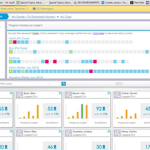
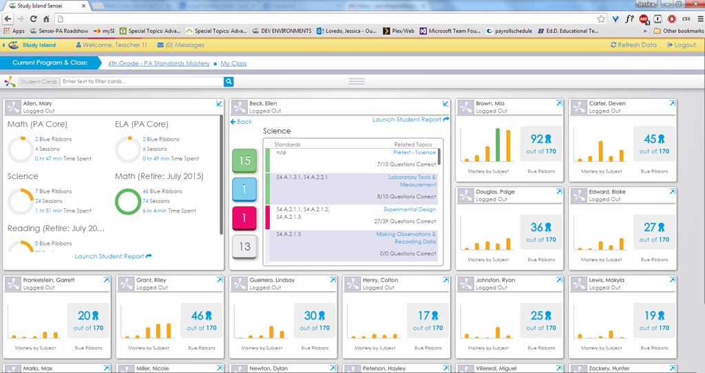
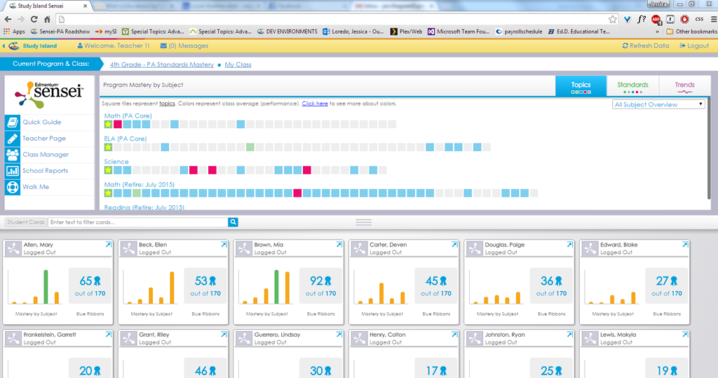
This particular project focused on solving some of the challenges educators had in already well-loved product. The web-app boasted a robust reporting enginge that captured every combination of student data educators could dream up. However, the reports were static exported .pdf's which as you can imagine didn't feel interactive or allow teachers to easily take action on the data. Furthermore, while there had been an attempt at a live view capturing student status in the application, educators wanted a more visual picture of what their students were doing inside the product, on a daily basis. The current live view just didn't cut it!
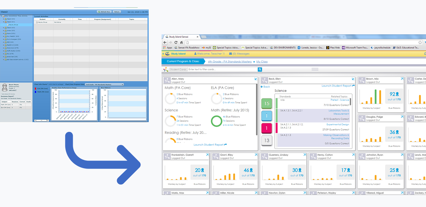
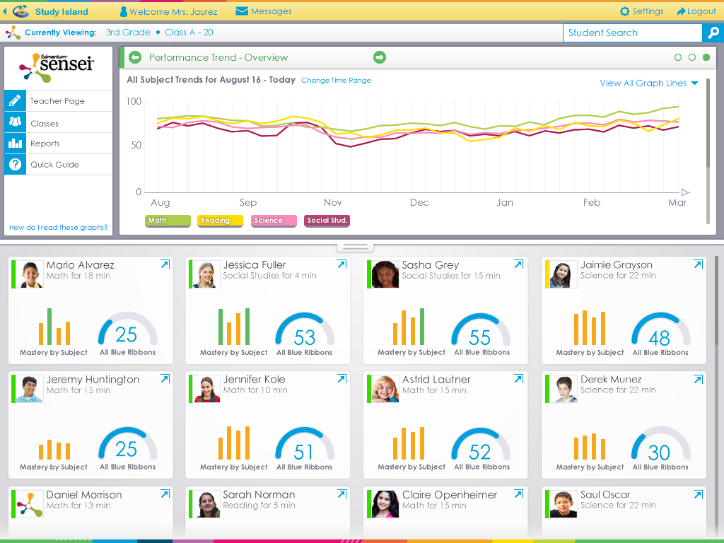
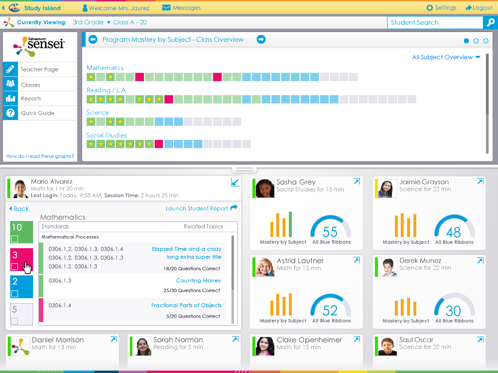
The project scope was rather lofty considering the short design timeline of about 3 weeks. Within that time, I met with the product manager to understand the main challenges and pain points of the users. I then concepted, prototyped, and eventually supported a launch of a new actionable dashboard for educators.
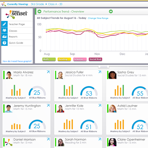
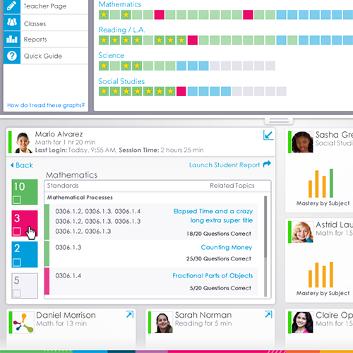
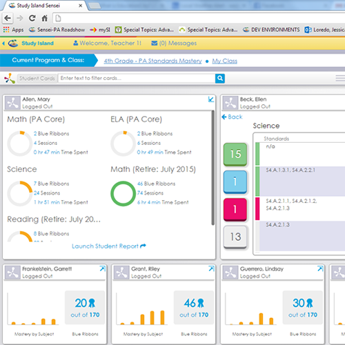
Educators needed an easier way to analyze student performance and take action on that information.
Market Research, UX Design, UI Design
Images Images
Project Outcomes
We monitored usage after releasing and while there was a surge of usage at launch, we found that after 6 months about 65% of users actively continued to used Sensei, though they had additional feedback for improvements. We continued to evolve the data visualizations and plan on updating the UI once again to match the updated UI of the rest of the application (the product's core UI patern's were updated by a different designer about 2 years ago).
In retrospect, a longer design phase may have resulted in a few key improvements. For myself, I feel that the data visualizations on the student cards could have been explored further and improved. I also feel that the constraint of Sensei living in its own environment detached it from the rest of the application which hurt its visibility and long lasting adoption.
While we got positive feedback on the colors having an easily understandable meaning, I feel we could have scaled back and done an accessibility evaluation to ensure color contrast and readability.
Overall the project was successful in giving many educators the ability to see data at a glance and take action on that data. While the data visualizations could be improved in the future, Study Island Sensei served as a cornerstone to updating the rest of the application and inspiring a hots of business initiatives, such as updating the rest of Study Island app, reducing reliance on the reporting enginge, and better surfacing data in the app overall.