
Strengthening Design Patterns to Increase Sales
Jessica Loredo
Feb 5th, 2020
Summary: Refreshing design patterns across multiple platforms
This case study is currently undergoing an update. Check back soon!
My client for this project wanted to update the look and feel of their subscription and purchase pages for their key product. They requested a review of their web pages and my goal was to review them for consistency, usability, and cohesive branding. Overall I created around 15 different options that load up depending on what link brought a user to the site. The two main categories were a set of subscription pages with different pricing options and a set of "100 Free Question" pages that prompted users to sign up for a free account, without subscription information (provided later). After implementation of the new pages, we tracked membership and subscription numbers to verify design changes and refine if needed.
Client needed refreshed branding and page layouts to help increase sales for their key product.
Product Research, UX Design, UI Design, Graphic Design
Key Problems: Cognitive Burden (too many things to look at)
It's tempting when you're trying to sell a product to put in as much description and information as possible. But often times this just leads to a messy and confusing design. They key is to provide an "information scent" that allows users to click into or scroll to areas for additional related detail. One of the biggest issues I found with the original page layouts was the repetitive amount of text in key areas. I spent most of my time cleaning up word and suggesting copy edits for the pages.
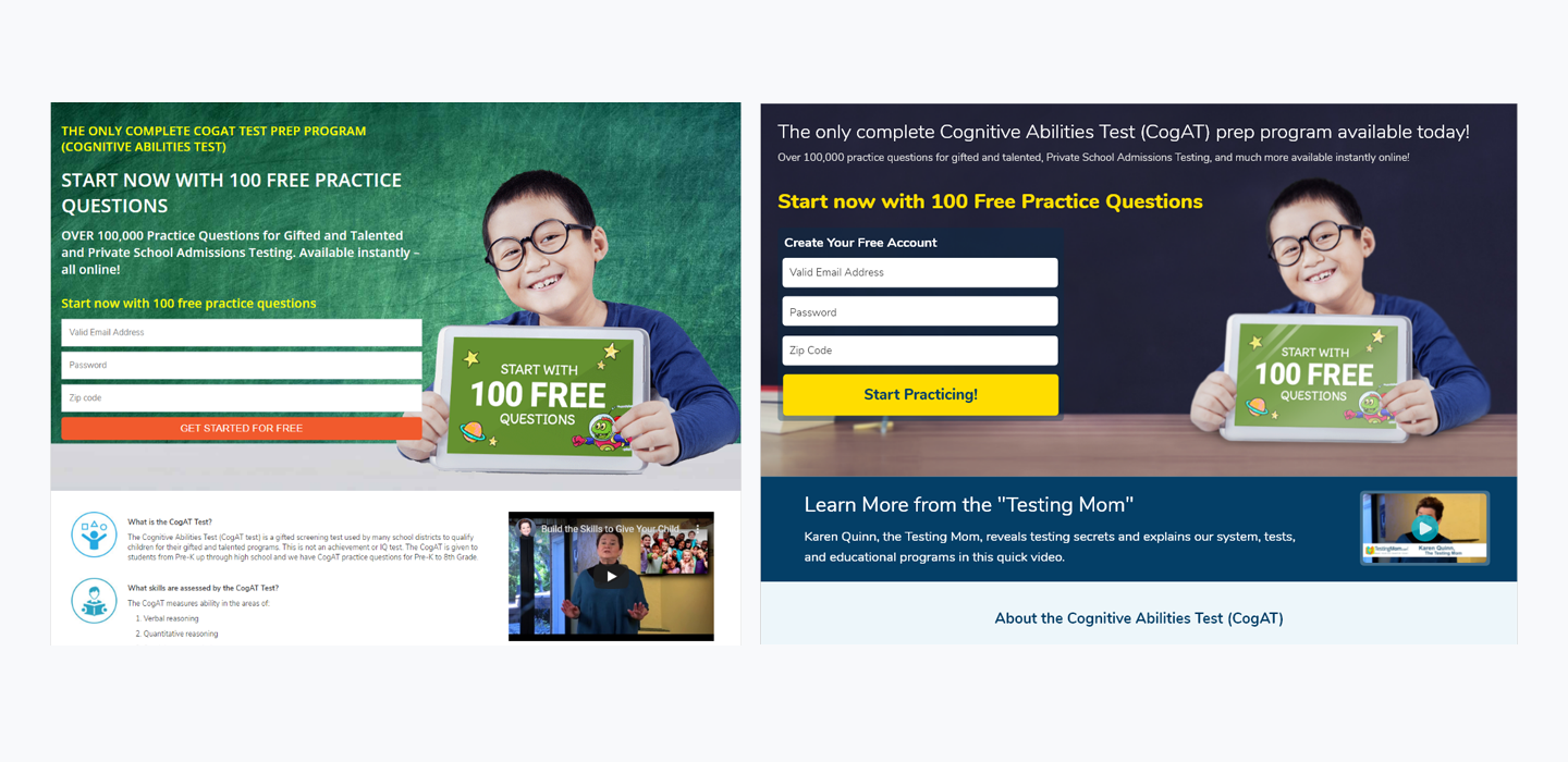
The second area that needed attention was the heirarchy and typography of the pages. Creating a visual structure to the page can help users quickly identify useful information. One of the biggest improvements a site can make is to help the page feel "scanable". Users should be able to scroll through the page reading the largest text and be able to undertsand what the page is about or in this example, what is being offered and associated costs. In the example below, you can see that there is too much competing information in similar sized fonts/colors with a busy background. While this page on its own performed better than others in the past, I attribute it to the fact that the boy holding a sign, stands out apart from all the other text, helping the user understand what is being offered quickly.
Audience: Parents on behalf of their children taking entrance or gifted exams
The audience for this particular project is typically parents who have primary age kids that are in the process or about to take entrance exams to private schools or gifted programs. While ther are students who sign up themselves, high school typically, that is a rare use case.
Team Structure: Design/Development Partnership
I served as the sole UX expert on the team. I discussed my work directly with the CEO and one other developer. We made changes based on feedback and refined as needed. I also provided support to the developer through creating custom graphics and exporting prototypes in Adobe XD so that they could use the developer tool to "grab" color and other style information for their needs.
Scope/Constraints: Limited time and budget
While I always recommend a full design process for solutioning any problem, the reality is that some companies do not have the budget or they are not at a level of UX maturity to afford the time, effort, and cost necessary to take all the standard steps. As a UX deisgner, I could throw my hands up and move on, however, I'm a firm believer in small changes (made in the context of better usaiblity by an expert) can lead to real and profound results. There is a fun story about the $3 million dollar button that illustrations this point well.
That being said, the biggest constraint was simply time and budget. I was given two weeks to complete the initial set of changes and an additional week or two at a later time to make refinements.
Process: Phase 1 - Buy Now Subscription Options, Phase 2 - 100 Free Questions
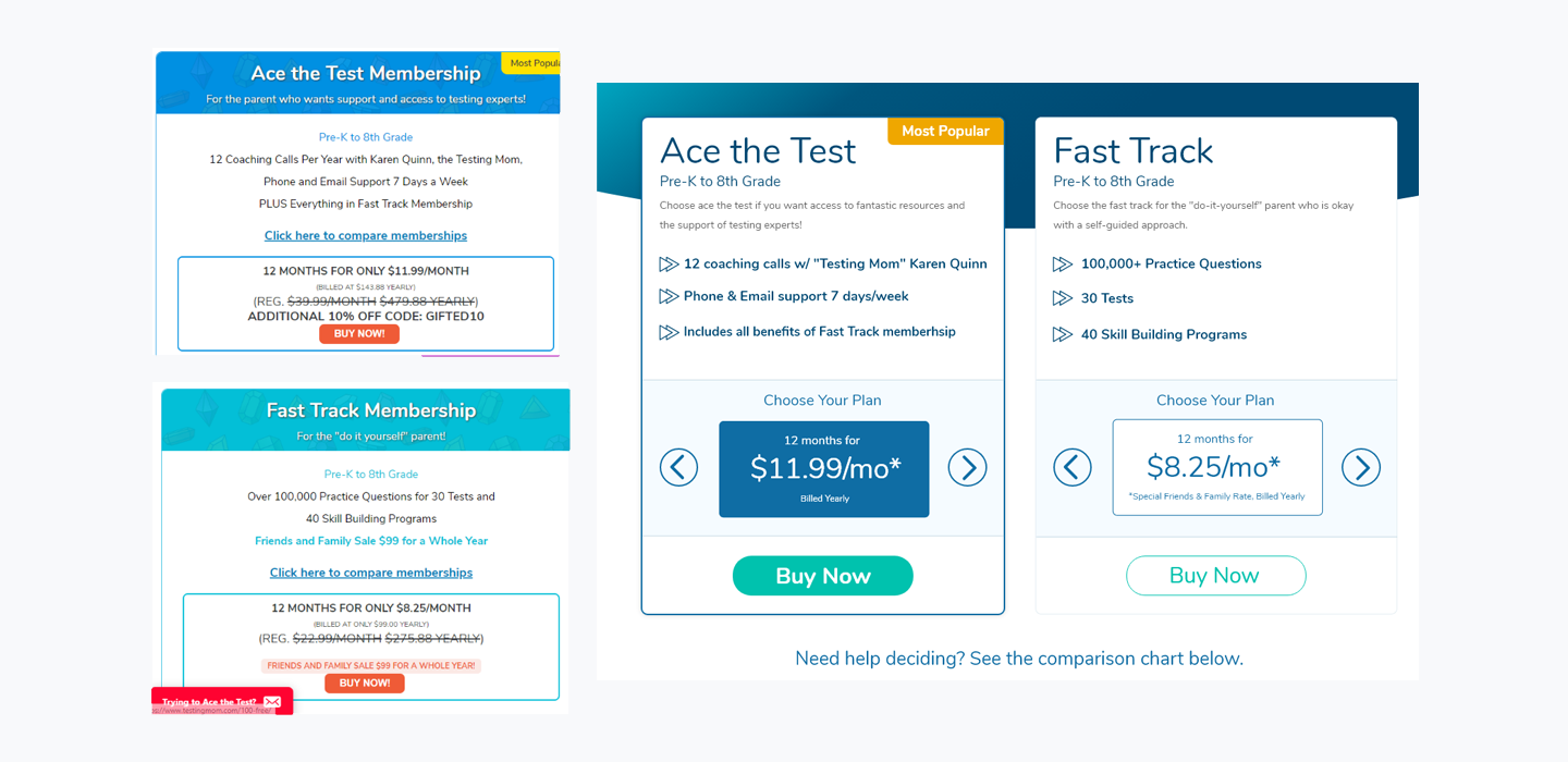
Essentially the updates broke down into two main projects. The first project was more aimed at presenting subscription information in a clean and easy to understand way for customers. After reviewing the current designs, I began laying out new page elements using simple design principals. I added negative space, created text/visual heirarchy, used contrast and color to drive a call to action.
The client had something specific in mind for the pricing interaction and so I worked with him to layout what his vision was for the component. You can see a carousel like interaction on the pricing information. I noted that often consumers may not even scroll left/right with carousel interactions, so it would be best to leave the pricing model that was most popular (or that he wanted to push) as the default for each program (ace the test vs fast track) if he was set on that model.
It's also important to note that there are actually 6 distinct pricing models going on here. Three under each program (ace the test, and fast track). There is also some detail around the price itself displayed as a monthly cost, but being billed at a quarterly or yearly interval. I recommended reducing as much visual information as possible at this point to make decisions about purchasing easier for consumers. My client wanted to proceed with this design, but later you will see an update to this mockup reflecting my initial guidance.
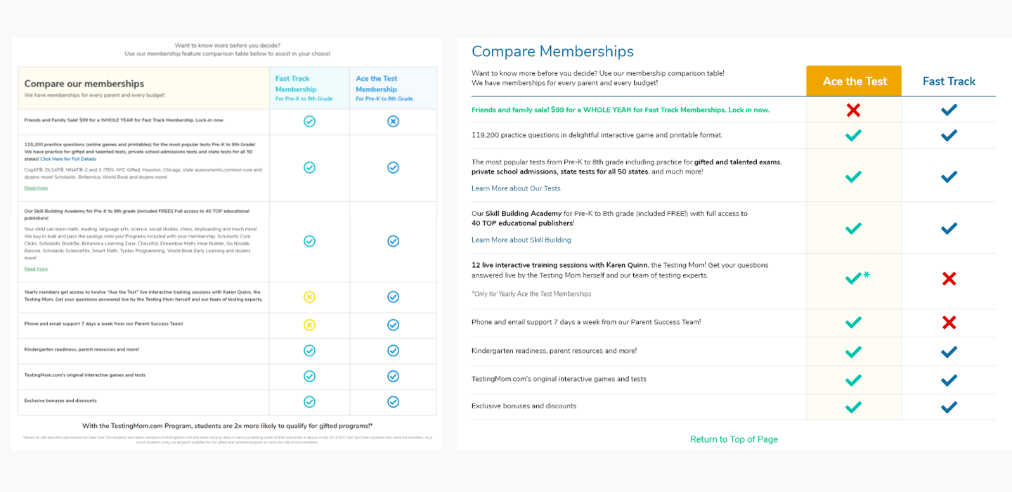
Afterwards I moved onto the table details element that had long paragraphs of text, which I hid under a "learn more" link. This gave the table easier scanability and allowed users to dig in for more details as needed. I also increased contrast in line with accessibility standards (though if I'm being honest there is room for improvement). The updates shoretened the length of the table and the page. I also added a convenient "return to top" link to help users pop back after lenghty scrolling, particularly on mobile.
I'm currently updating this study. Check back soon!