
Visualizing Assessment Performance for Educators
Jessica Loredo
Aug 20th, 2019
Summary: Redesigning the student assessment report
I worked on an individualized learning product that boasted a proprietary adaptive diagnostic assessment for K-12 students. Simplified, it's like a test that adjusts difficulty based on answering questions correctly or incorrectly. After the test, a unique learning plan is created that contains interactive lessons and activities structured to improve that student's skill gaps. The outcomes of the test should be accessible and easy-to-read by educators. However, the first iteration of the report had flaws.
In an effort to create a simple and easy to read report, many details were cut out in the original version of the report. This lead to educator's making incorrect assumptions about student performance, learning paths, and the test itself. To tackle this issue, I collaborated with product managers, researchers, and developers to redesign the post-diagnostic student summary report with the help of educator feedback and a three-day design thinking workshop.
Educators needed a better way to understand the outcomes of student diagnostic assessments so that they can develop strategies for student success.
Product Research, User Interviews, Usability Testing, UX Design, UI Design, Design Thinking Workshop
Key Problems: Reports need more meaningful detail and better legibility
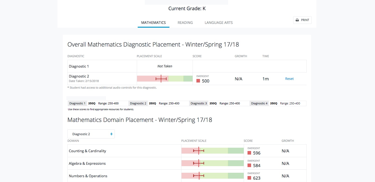
Our first step was identifying the issues with the current report. We dove in and identified a few key issues. The current report boiled information down a little too much. We provided an overall score and some domain-level scoring (domains are like a group of skills). However, without revealing too much behind-the-scenes algorithmic goodness, our research team informed us that the domain scoring was a bit problematic. This was one of the sources of confusion for educators.
The test itself attempted to reveal an on, above, or below domain score (E.G., "This student is above his or her grade in Algebra"). From a UX perspective this makes perfect sense. It's easy to understand and is actually what teachers asked for time and time again. However, we weren't quite there yet in terms of having the accuracy we wanted in making those determinations. So we were actually painting the wrong picture for educators. This meant that Educator's made assumptions about where a student was at in terms of skill level and it didn't always seem to match up! Educators began to dig in and wanted to ask more questions but we didn't provide this level of information at all. I crafted a problem statement to capture my thoughts:
Problem Statement: "Our diagnostic summary report is intended to provide educators accurate insights into a student's skill level across several key domains thereby instilling trust in our assessment and product.
We have observed that the product is not providing enough detail leading to inaccurate assumptions and eroding trust in our product's ability to accurately determine student skill levels based on our assessments.
How might we provide a more accurate and insightful report of student skill level so that educators can provide meaningful classroom support and improve trust in our products?"
This gave me a starting point in terms of what I felt were the key areas of improvement for my solution to be successful. The final solution needed to be accessible, intuitive, and most importantly provide an accurate picture of student skill level. This meant balancing easy-to-read with accurate and in-depth. Lastly, I noticed a distinct lack of color and contrast in the original report (not accessible). Fixing the minor accessibility issues and driving a more modern design would be icing on the cake. Time to dig in!
Audience: Reporting for educators, parents, and sometimes students
The primary users are educators. Based on feedback, they may choose to share results with parents and maybe even students. This was completely dependent on the philosophy of the educator. We kept this in mind in the design phase as we wanted to ensure that the reports gave enough information to educators, but was still digestible for other audiences should an educator choose to explain test results using the report, for example, during a parent-teacher conference.
Team Structure: Agile/scrum team with UX up-front
Our team uses scrum/agile methodologies on a daily basis. Product managers and owners work with the designer to define the problem, create wireframes, concepts, mockups and prototypes. We complete the bulk of that work before hand-off to development. During the iterative phase we seek feedback early and often to refine our ideas. At about 80% completion we get ready to hand off our designs to development. As a designer, I continue to work with development to refine the design live an in code. The sprint team works in two-week sprints and tracks tasks on a scrum board managed by our scrum master. We had daily standups to highlight any roadblocks or areas where I might need to step in and help adjust designs.
Scope/Constraints: Three new report in collaboration with new research partners
Time is always a constraint, however in this case we sought to be ambitious. Our goal was to evaluate and redesign three new reports and develop them in the scope of about 3 months. The scope of this particular case study is focused on just the student report, but I wanted to note that I was working on two other report redesigns in parallel to this project.
Secondly, this was our development team's first time working with a brand new research science team at the company. This can create a cultural/team dynamics shift so we needed to adapt to the new team members and include them in our work as well. Luckily, the collaboration went great and I think strengthened the overall solution.
Process: Design Workshop > wireframes > prototype > testing > production
We kicked off this project with a three-day design workshop hosted by our new VP of research & design and co-led by yours truly. We used my initial problem statement and research to communicate our problem to a larger group. At the end of the workshop my goal was to refine the wire-frames we had put together into a prototype and begin user testing of the course of a couple months. After we received feedback and made adjustments, and many break-out meetings after that, it was time to start bringing the development team onboard. We had a design review meeting to discuss the reports. In that meeting, it's a chance for developers to poke holes or offer up suggestions or improvements on the overall design, perhaps catch things that we missed. During development I supported the team through creating assets, updated our pattern library, and generally made myself available as a supporting role for the dev team.
Design Workshop
There were about 10 people invited to the workshop from varying departments in the company such as: UX, research, curriculum, sales, and product management. Our agenda focused on market research and a discussion on pros and cons, a small-group sketching and brainstorming session, and then a large group session. During the large group session, I lead the discussion and wire-framed our ideas captured in our small-group phase. We sketched out three rough designs focusing for each report, with a focus on the student report. Here are some of the key questions we sought to answer with our new designs:
- How might we defensibly show domain level information that doesn't lead to inaccurate analysis?
- How might we expose details about the test, that won't reveal too much of our proprietary diagnostic design, but still provides meaningful data for educator analysis
- How might we visually display meaningful information about student growth over time? (something that wasn't present in the initial design)
- How do we make this report, easy-to-ready and quick to understand?
Prototype
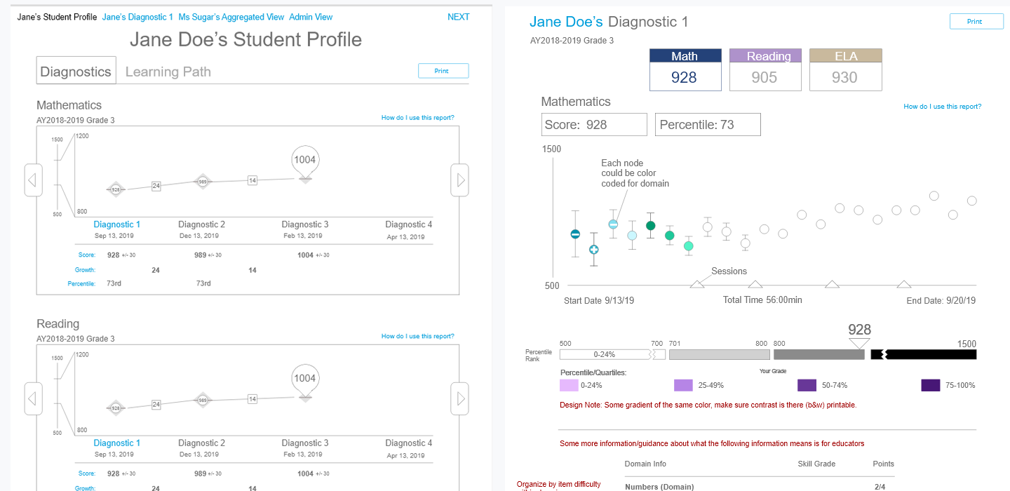
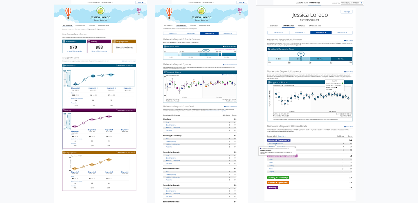
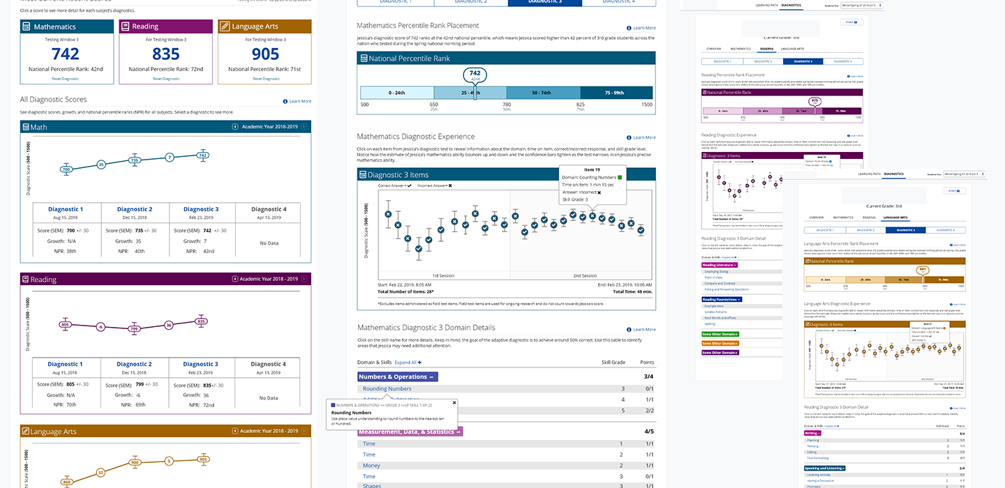
After creating our initial set of wireframes, I set out to create some hi-fidelity mockups and eventually a click through prototype using Adobe XD. The prototype was broken up into two main areas, a student overview page that gave a picture of student growth based on scores on the diagnostic over time for each subject (math, language arts, and reading) and a more detailed view of the subject specific diagnostic view (including domain level information).
User Testing
After some additional refinements, and writing an initial testing script we finalized a prototype complete with interactions that complimented our usability script. I worked with the research scientist to develop one informal feedback testing session and one more formal script that sought to identify statistical validity for our design. We ran 3 informal feedback sessions and 5 formal sessions with various educators. The bulk of the user testing script asked educators to locate data and interpret the data they were looking at in the prototype. We were looking for correct interpretations as positive reinforcement for our design. Our findings suggested we nailed the navigation, but we still had a few loose ends to tie up in terms of color and understanding the student growth overview graph.
- Users generally were able to navigate the report easily and find pieces of information without much guidance.
- Users struggled to correctly identify some pieces of information or their interpretation was slightly off, particularly due to the scale visual on the student growth table and the color coding on the diagnostic test visual.
- Users who were familiar with previous reporting designs commented they liked the simplicity of boiling down a users score to "negative, neutral, positive".
We compiled our results and presented them to our stakeholders. After sone discussion, we addressed those key areas and some other minor updates for a final design that was ready for development.
- During testing, educators had difficulty with interpreting the growth scale. I simplified the scale to simple numbers and there was a marked improvement on interpretation in further testing.
- Based on early testing I reduced colors in the growth graph from three colors to one color to reduce confusion on color meaning.
- Though educators enjoyed the original three-color on-above-below scale per domain, it was a strategic decision to remove the visual in lieu of providing raw scores (E.G. "2/3 pts") by domain. This made the report slightly more cumbersome to read, but provided an extremely accurate picture instead of an averaged and fuzzy picture. The goal is to be able to grow and improve our assessment so that one day we can add back in color coding to help with readability.
- In post release survey's Educators had mixed feelings about removing the on-above-below scale but agreed that the report felt more detailed and accurate.
- The team opted for a more simplified header instead of a fun visual one that matched the student UI to save time on development.
Final Design
Our designs went live about 5 months after we began the design phase. Overall, the results have been favorable, with teachers praising the new data visualization for student growth and assessment performance primarily. We have some requests for increasing color coding in some areas and we spent a long time adding in support materials via "learn more" links in the reports but 6 months out, we are still confident in our designs, and that the data is defensible and accurate.
Final Thoughts
I loved that this project had so much focus on using design thinking frameworks to innovate on a new design. I got the pleasure of digging deep and got to work with some smart-as-a-whip research peers which I think strengthened the overall design. There are no major changes needed for this report after 6 months, which to me, is fantastic and shows the strength of the design to stand on its own. If anything we've heard educators asking for additional information, but really resonating with the current design.
Update 10/25/20:
It's been almost two years and our reporting design has garnered a few questions but still remains a strong overall design. Our next hope might be to update the look and feel to use less ink (less colored blocks) and use a slightly more refined toned down color palette. We also want to give a more visually representative picture of what numerical scores mean up front. Beyond that, the initial design has reduced support calls and clicks on help center and set a new standard for assessment visualization at the company.