Designing a New K-2nd Grade Learner Experience
Jessica Loredo
February 1st, 2020
Summary: Creating an Engaging Platform for Students
It's rare as a product or UX designer that you get to design a product from the ground up. I was given that opportunity when the company I was employed at wanted to fill a gap in our product offerings. The challenge was big. Design a new learning experience for an individualized adaptive learning product.
The product would cover students from K-12 (and need an administrator and educator experience as well). If you’ve never designed for kids before, I’ll be the first to tell you that it is well…complicated. Unlike adults, the needs and engagement are far different for a 1st grader than say, an 8th grader. If you have kids yourself, this will come as no surprise. So, we couldn’t just develop a one-size fits all platform and expect it to be the best possible experience for all students.
We also had a very limited amount of time to complete the majority of the design. And by very limited, I mean, one month. One month to design a brand-new, state-of-the-art, learning experience. Because of this, we opted (and rightfully convinced leadership) to design for smaller segments, K-2 and 3-5 would be our starting place. This case study focuses on the K-2 experience.
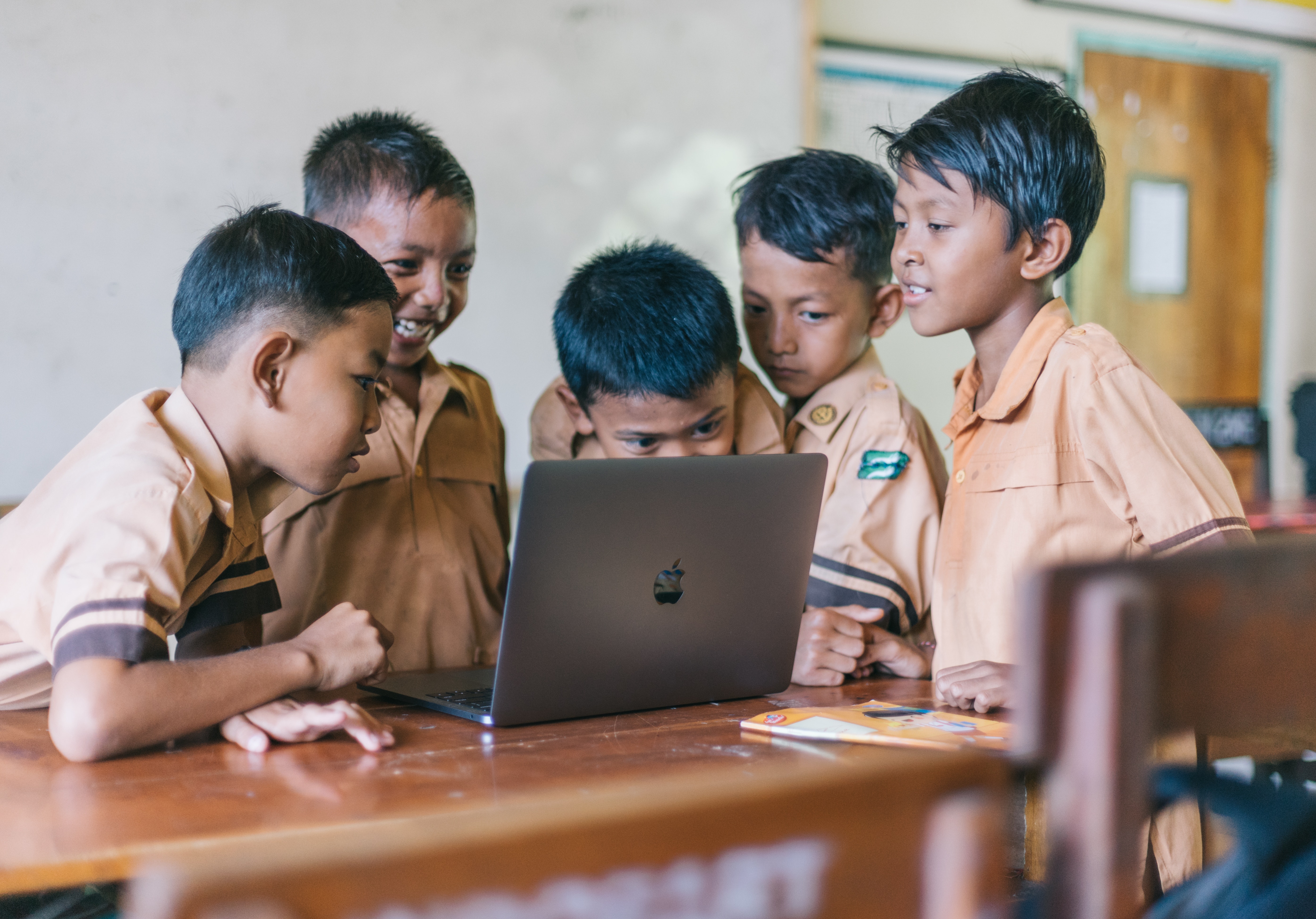
In addition to the design work (problem statements, wireframes, mockups) I reviewed the market analysis on similar products, conducted interviews with teachers and students about their experiences with similar products, and performed usability testing. And most importantly, tried to remember that these were kids who likely just want to have fun all day and eat cake. Engagement would be key.
Design a new K-2nd grade experience students not only used to access their individualized learning paths but also that delighted and engaged them.
Product Research, User Interviews, Usability Testing, UX Design, UI Design, Graphic Design
KEY PROBLEM: DESIGNING AROUND TRADITIONAL LEARNING FRAMEWORKS
Prior to this work, the team had built an experience for grades 3-5 for this product. We hoped to leverage some of those design patterns for this project. But it was unclear whether a K-2 experience would benefit from design principles used for 3-5 students. So, some assumptions were made in how to approach the design differently. These assumptions would eventually need to be validated.
Technology also played a large part in defining constraints for this project. To make a truly adaptive learning path, students needed to linearly complete a set of lessons and quizzes. They would then take a final assessment and depending on their score be routed to re-taking lessons or be served up a new set of lessons and quizzes. While this sounded good in theory, the pattern was very repetitive and could be frustrating at times for students. Often as designers we must work around technical or other kinds of constraints. In this case, it was the framework of the curriculum that was the primary constraint.
One of our big challenges was: how might we create an experience is simple and engaging to K-2 audiences within a somewhat repetitive learning structure? I leaned heavily on my background in games. After all, students will spend hours "grinding" in MMORPGS (Massive Multiplayer Online Role-Playing Games). Grinding refers to spending time collecting or earning resources by doing often repetitive tasks. It's usually not the main point of the game but is a necessary evil to advance. My goal was to apply elements of game design to the new K-2 learning experience. We also made several suggestions to the curriculum team based on student and educator feedback, however changes to the framework would take time.
Audience: KINDERGARTEN THROUGH 2ND GRADE STUDENTS
Early in this project, we made a conscious decision to break up the younger student experience into two grade bands (K-2 and 3-5). While we bucketed Kindergarten with 1st and 2nd grade, I made it clear that Kindergarten had specific needs that would need to be addressed at some point in the future. This was based on user testing conducted prior to design work, kids in the 5-K range struggled to navigate some of our other learning products.
You can see some clips from the usability testing I conducted below. Notice how the kids with lower dexterity (normal at this age) results in students tapping haphazardly with minimal to moderate success on tablets while. On the laptop, the addition of simple tactile buttons leads to a much more successful interaction.
At this age kids are more likely to look at teachers for help and direction if they cannot figure out how to use something. This increases the need for an educator’s attention rather than reduces it. One of the key tenants of designing for the classroom is not to add unnecessary complexity or additional time to a teacher's day. Something I always keep in mind when designing education experiences.
Team Structure:
Our team uses scrum/agile methodologies. Product managers and owners work with the designer (myself) to define the problem, create wireframes, concepts, mockups, and prototypes. We complete the bulk of that work before hand-off to development. During the iterative phase we seek feedback early and often as well as conduct usability testing to iterate and improve on our ideas. At about 80% completion we get ready to hand off our designs to development. As a designer, I continue to work with development to refine the design live in code. The sprint team works in two-week sprints and tracks tasks on a scrum board managed by our scrum master. We had daily standups to highlight any roadblocks or areas where I might need to step in and help adjust designs.
Process: Competitive analysis > problem definition > prototype > testing > iteration > production
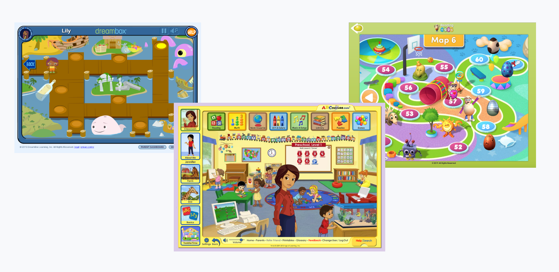
I went on a kid’s app bender and dove deep into early-learner experiences. I found that many competitor products aimed at this age range had one thing in common. They were all packed to the brim with activities, content, and colorful objects competing for the student’s attention. This is everything you have been taught not to do for adult interfaces. It was horrifying. Furthermore, what did this mean? The products in the image above were all incredibly successful products. But there were limits to my competitive analysis as I did not necessarily know why students found these products engaging.
What I did unearth was that many students resonated with game-like interfaces. The representation of a narrative experience and specifically the ability to create avatars was especially common and popular. There was also the perception that there were lots of activities to choose from. The fundamental difference here is that these applications do give the learner choice or at least the perception of choice. There is no sense of a rigid learning experience that must be followed to produce the intended learning outcome we were trying to defensibly achieve with our product.
Knowing that competitor products had different goals in mind meant that these products would not necessarily be an example of an effective model for what I was creating. However, I needed to keep progressing so my next step was to start defining the goals/problems for the experience I wanted to build.
Here is a quick look at goals and constraints for the project:
- K-2 students need an experience that emphasizes student agency (it feels like they have a choice of what to do next)
- K-2 students need an experience that feels engaging or game-like and is aesthetically age-appropriate
- K-2 students need a system that easily affords feedback on performance and progress to promote motivation
- K-2 Students need an experience that supports additional communications and assignments from their teachers
- Learning content could not be integrated into core platform experience. This means that content navigation was fundamentally different depending on which content (lesson) was served to the user.
- Some content was legacy and built with Adobe Flash technology which was increasingly unsupported
- Unsure whether existing grades 3-5 design patterns could be leveraged for K-2 experience
- Rigid learning content designed by internal and external curriculum teams could not be adjusted within the scope of this project
Other Key Questions
A La-Carte or 5-Course Meal?
Early in our discussions, there was debate around whether or not to define a linear path for students to follow (one activity at a time in order) or to provide an open buffet of activities for students so that they felt a sense of agency in what order they approached their learning tasks. The 3-5 student experience provided options and allowed students to pick and choose the order in which they completed tasks. Furthermore, we had another product that was quite popular with the K-5 age range that was also “a la carte” style (students could start any activity in any order). Students notably had little difficulty in navigating the experience.
But K-2 is different. There was a concern about exposing too many items or activities on the screen at one time. While we expose quite a few activities for 3-5 we wanted to be sensitive to our younger learners, as the boundary for cognitive burden is lower. So our question became, how important is student agency to a K-2 learner and how might we provide a narrative, engaging, experience that promotes this sense of agency?
"Gamification" buzz word or bad word?
There is quite a bit of debate about how to effectively use engagement concepts like gamification in learner experiences. Some critics believe gamification elements take away from the core aspect of learning. These experts believe learning should provide all the reward and engagement a learner would need (nice notion). However, today’s digital natives are consistently exposed to highly interactive experiences. How might we provide a similar level of polish and engagement to foster interest and focus within our products?
Today's digital natives commonly interact with high-quality visual and interactive design since they were able to hold an tablet. Their opinions on design and what they like, may be more polished and refined than perhaps a child of the same age even 10 years ago. For example, I once had a 2nd grader ask me about the meaning of an icon (wasn't immediately obvious to them) in my prototype and then much to my surprise, suggest a better one! Little designer in the making!
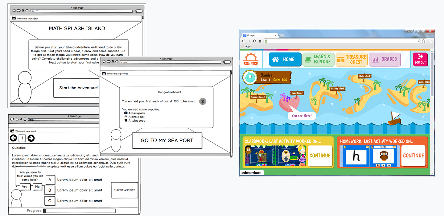
Prototype
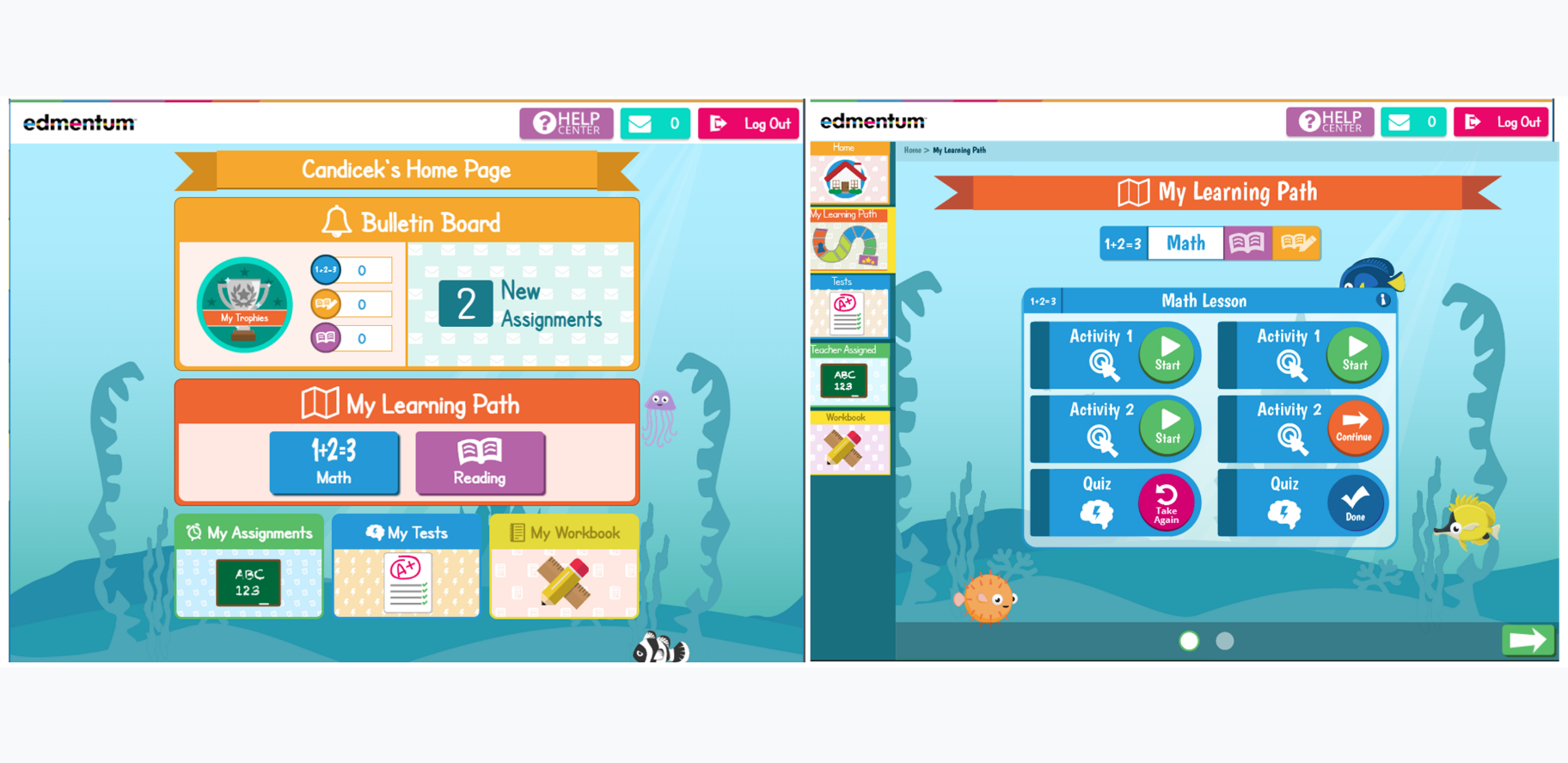
For the visual interface, we went through a short review process internally and chose a style that mimicked our 3-5 experience with a sea theme instead of a sky theme. This was purely aesthetic and served the purpose of differentiating the experiences but re-using existing 3-5 patterns due to time and budgetary constraints.
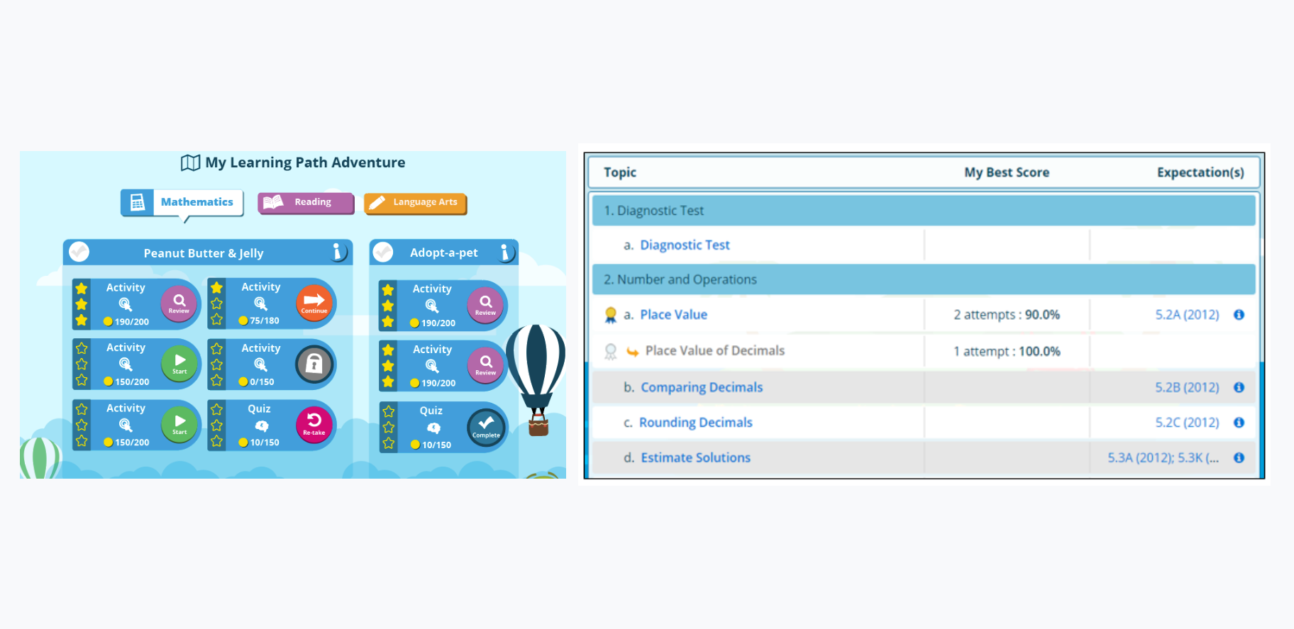
My main goal during this phase was to create a prototype to test key concepts on students in the classroom. The prototype was broken up into two main areas, a home page that gave students an overview of main tasks and activities, as well as a “short cut” button to jump right into learning, and the learning path page which served as the core experience for navigating their learning journey.
As you can see, we opted to reduce the gamification elements primarily due to budget and resources. The first slice of our product was intended to focus on student agency, student progress, some sense of game-like engagement (which we achieved through adding skill trophies) and a navigation that supported additional assignments and activities assigned from the educator.
- Dashboard like homepage that displayed key areas of the application
- Student progress through visualizing skill trophies in “rewards” area
- Quick-jump button to learning paths
- Learning path page that supported student agency and choice of task
- Game-like aesthetic and engagement concepts (skill trophies)
User Testing
Initially I intended to take the prototype on the road, but due to the rapid need for this product to enter the market, most of my design work was being developed as a beta product in tandem to my user testing (talk about building the plane while flying it).
Because of this, we ended up using the beta version to test rather than my final prototype. We tested three classrooms (between 10-15 kids) in grades K-2. We incentivized feedback by rewarding students with stickers. We tested each student one at a time and had them sit at the computer and try out the product. We asked them to complete a series of actions (task flow) and asked them about what certain elements on the screen meant (validation). Here is a summary of our findings:
- Logging in with a password was difficult for young learners who had not yet learned to type
- K students struggled with the navigation and frequently asked for help on how to proceed particularly when interacting with the learning path or content
- Content player navigation was confusing for all grade levels and students often struggled with how to move forward or exit the application (as it differed depending on content)
- There was no automatic save on learning content, so often learners would close the browser window and would loose their progress leading to frustration
- Skill trophies were interesting to students, but they struggled with how to earn them and what they meant
- K students were easily confused by the number of activities and statuses on learning path page activities
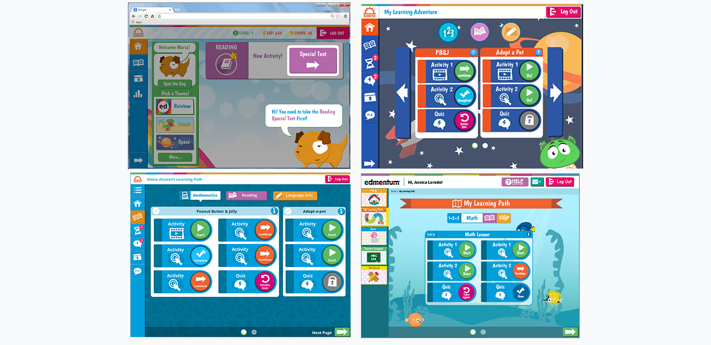
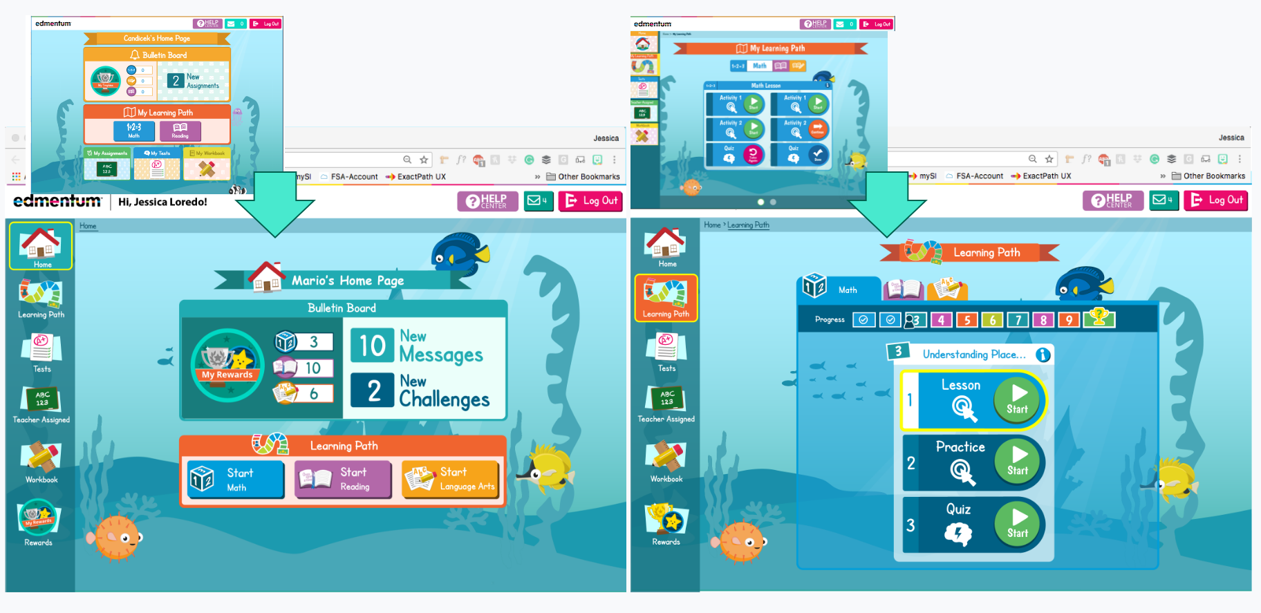
After research and analysis of the data was conducted, we made key changes to the interface as seen in the list below.
- Defined a new feature called “easy-login” that uses unique URLs and shapes instead of words for passwords
- Reduced primary objects on home page and added left-hand navigation to match learning path page (as you can see the navigation is missing on the home page)
- Enhanced left-hand navigation to more clearly show which page a student is actively on
- Made recommendations towards retiring old content styles in the learning content player
- Introduced an auto-save feature
- Reduced the number of activities viewable by the student at a time
- Highlighted progress by showing a board-game style progress indicator
Final Design
Final Thoughts
I learned a lot about designing for younger audiences on this project. As a designer for over a decade, I have an intuitiveness when it comes to designs that will work for the average consumer or common mental models.That wisdom does not always apply to younger learners. Even though the project timeline was extremely condensed, it meant I had to fight for as much usability testing as possible to leverage insights for my designs. And while the final design meets some of the needs for this audience and was more successful than simply re-using the 3-5 experience, I believe there is still room for much improvement. I will say my absolute favorite part of this project was spending time with students and observing them use products I've designed - even better when I got to see a sense of joy on their faces from something I created!